Starting Visual Identity (2/17-2/21)
This week I planned to start planning for a visual identity for the card game and continue user testing. I also have a scheduled call with Dan Brown, a UX designer who is dabbles in game design. Hopefully the game mechanics and testing will wrap up in a couple of weeks so I can truly start branding.
Moodboards
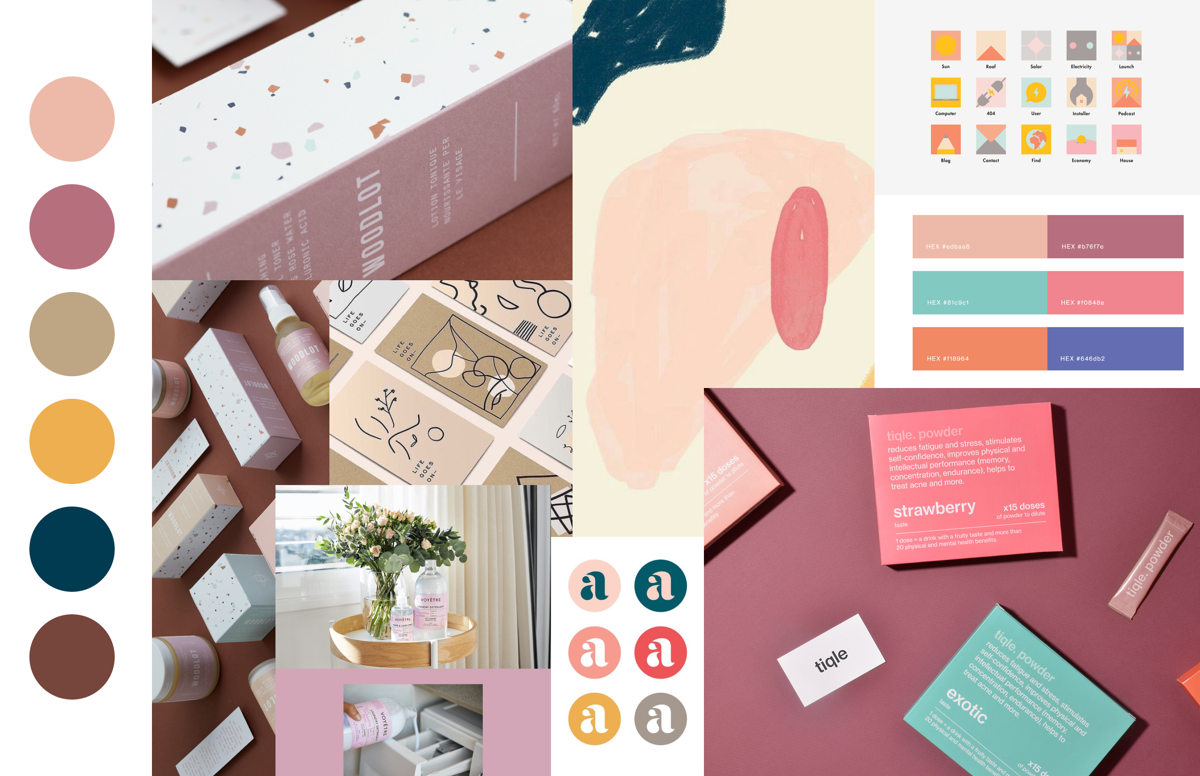


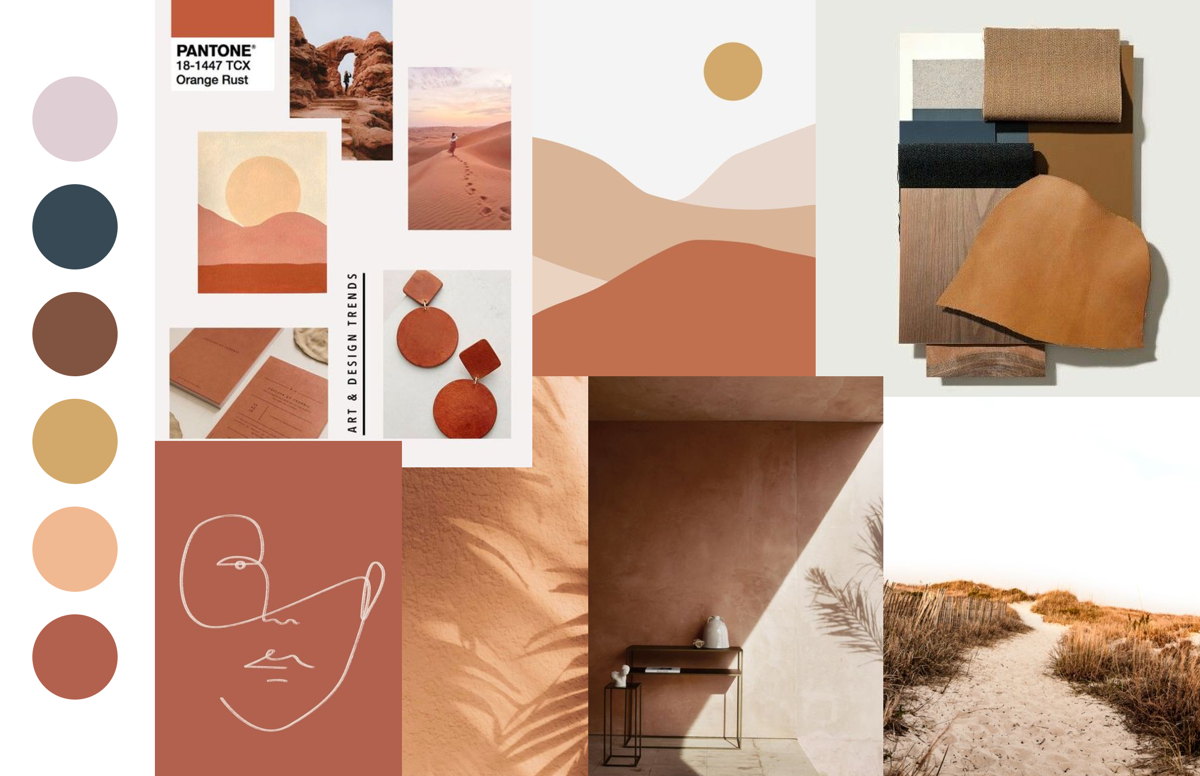
I made 4 moodboards to start exploring what mood or vibe I want this game to have. I had an initial color palette I used to try to establish how I wanted the game to feel, but I knew not to stay too committed to it. A majority
soft // warm // friendly
homey // inviting // natural
illustration // playful // easygoing
warm // vintage // relaxed
I was exploring different moods that all centered around feeling comforting and familiar but changing it up between each board.
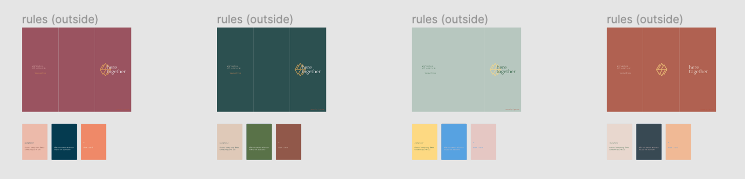
I quickly applied the color palettes to the rule design and cards I have to see what it could possibly look like. It also helped me see how the colors would actually look in relation to each other as a set. After looking at it from this spread, I was leaning towards the first and last moodboards, but I felt a stronger inclination toward the last one that followed the warm, vintage, relaxed mood.
Logo Design
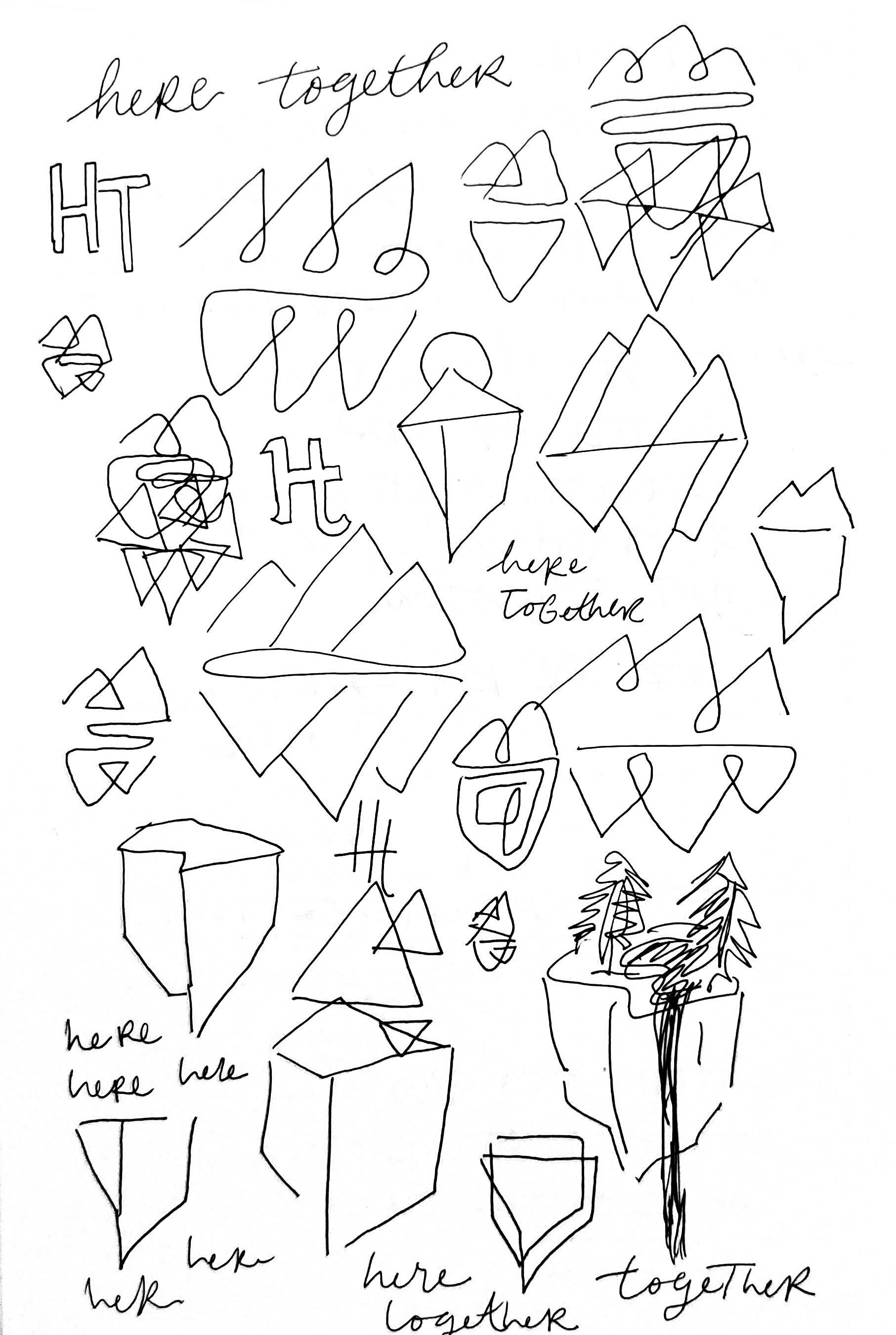
Before starting logo or branding, there was a specific type of imagery I wanted to include somewhere in the game, as it has a personal meaning behind it. Whether it came into gameplay or the logo, I wanted to include a floating island motif. I looked into floating island illustrations and also tried to look for existing logos with a similar graphic. I couldn’t find much, so I tried to start ideated on a floating island logo. Instead of making it extremely detailed and literal, I wanted to make it more symbol-like. I also liked the idea of having a logo that would look the same upside down, as it could be an element to incorporate onto the back of the cards.
As shown below, I used the initial color palette I started with as I didn’t have an established moodboard yet. I was drawn to the triangle shape as it conveyed a floating island is a conceptual way. I also played around with abstract, organic forms within the design.

I went on to have a more finalized color palette, but it’s still not set in stone. I explored the floating island concept more, still with triangles, but trying it out with different compositions.

I also quickly mocked up what the backs of the cards could look like with this logo and color palette to see how I felt about it. I’m happy with the direction so far, so I’ll continue to push it in this direction.

Scheduled Meeting
I have a scheduled talk with Dan Brown on Friday to talk about games and design. I want to hear his thoughts on my senior thesis project so far and how he navigates game design, specifically with cards.
Reflection
I’m excited to see how this visual identity develops with more exploration. I’m really happy with the moodboard and vibe of it so far. The logo might need some work but I might put it on pause for now. I wish I was able to do a bit more work this week, but I was also prepping for the career so I can hopefully look into full time jobs after the summer.
Future Steps
Next week, I’ll see how I can implement any comments and feedback I get after talking to Dan and after a few final user testing sessions. I’m going to continue with the visual identity and experiment more with how the colors and designs will look with the different card types and even rule design.