Card Revisions (3/2-3/6)
This week I plan to edit the card prompts to make them more universal and not so deeply personal. The structure of the game is effective, so I will only tweak it a bit. I’ll continue the visual design, mostly on the logo, making sure it’s legible from different distances. Lastly, I want to sketch out a few wireframes for a website.
Logo
During group critique on Friday, I wanted to get feedback on the visual identity I was working on. I wanted to see which ones stood out the most to them and why. This way I heard about what grabbed their attention and how to improve it.
Within my group critique, they all enjoyed the colored shapes that are imposed on each other. However, the feedback I received was that it wasn’t legible from far away. The first step I made was making all the shapes separate and opaque so that I could manipulate each individual color.


I worked on the colors to make sure it was legible on both light and dark backgrounds. I also made sure to get the contrast right so it would be visible from far away. After I got the colors I wanted, I went on to explore different variations on different backgrounds and outlines.

I chose this logo because it’s legible from different distances and it looks clean and comforting. A pleasant surprise was seeing how it reminded me of stained glass or a window. It matched the theme of what I was going for.

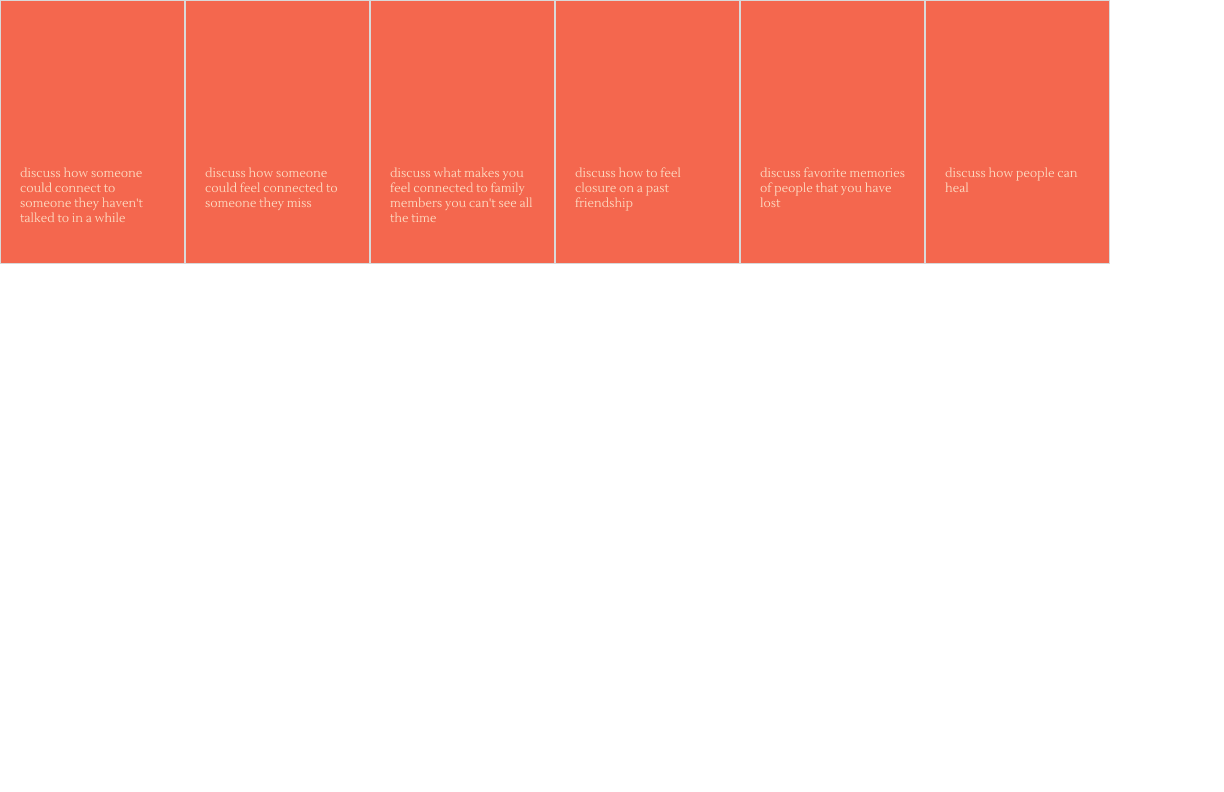
Cards
I started playing around with what the back of the cards would look like. This would be a design that players would constantly see so it would need to fully represent the game without being over-the-top.

I preferred the light background over the dark one.

And finally I chose this simple design (for now) because I don’t think the back design needs to be extremely elaborate. I kept thinking about making the orientation reversible, but that wasn’t necessary seeing that the other side would only be upright.

I did some explorations on what the front of the cards would look like.
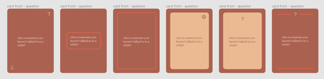
This is the design for the front of the cards so far. I’m not fully committed to it but I’m pretty satisfied with it. I won’t be surprised if I don’t change it up too much.

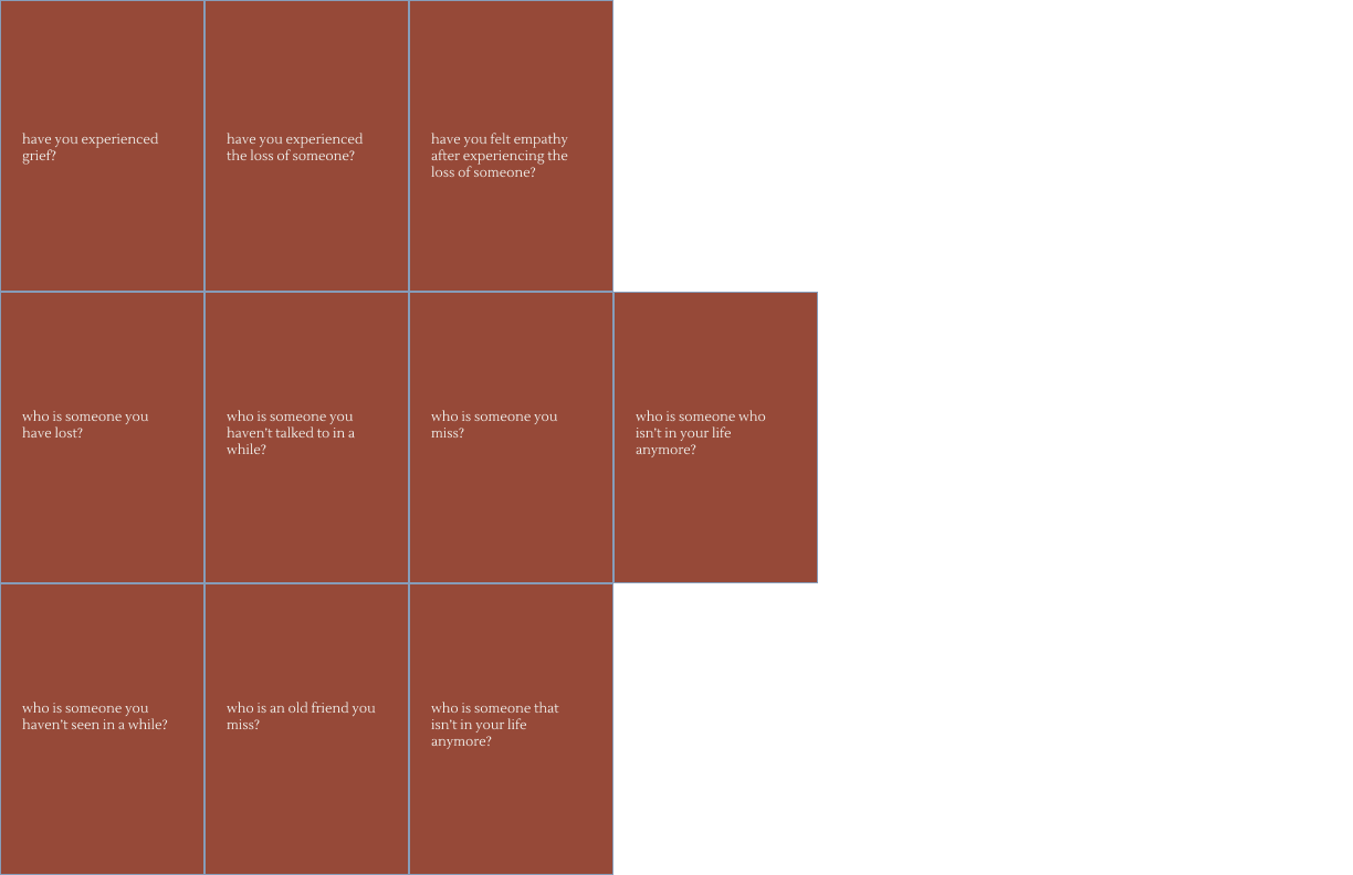
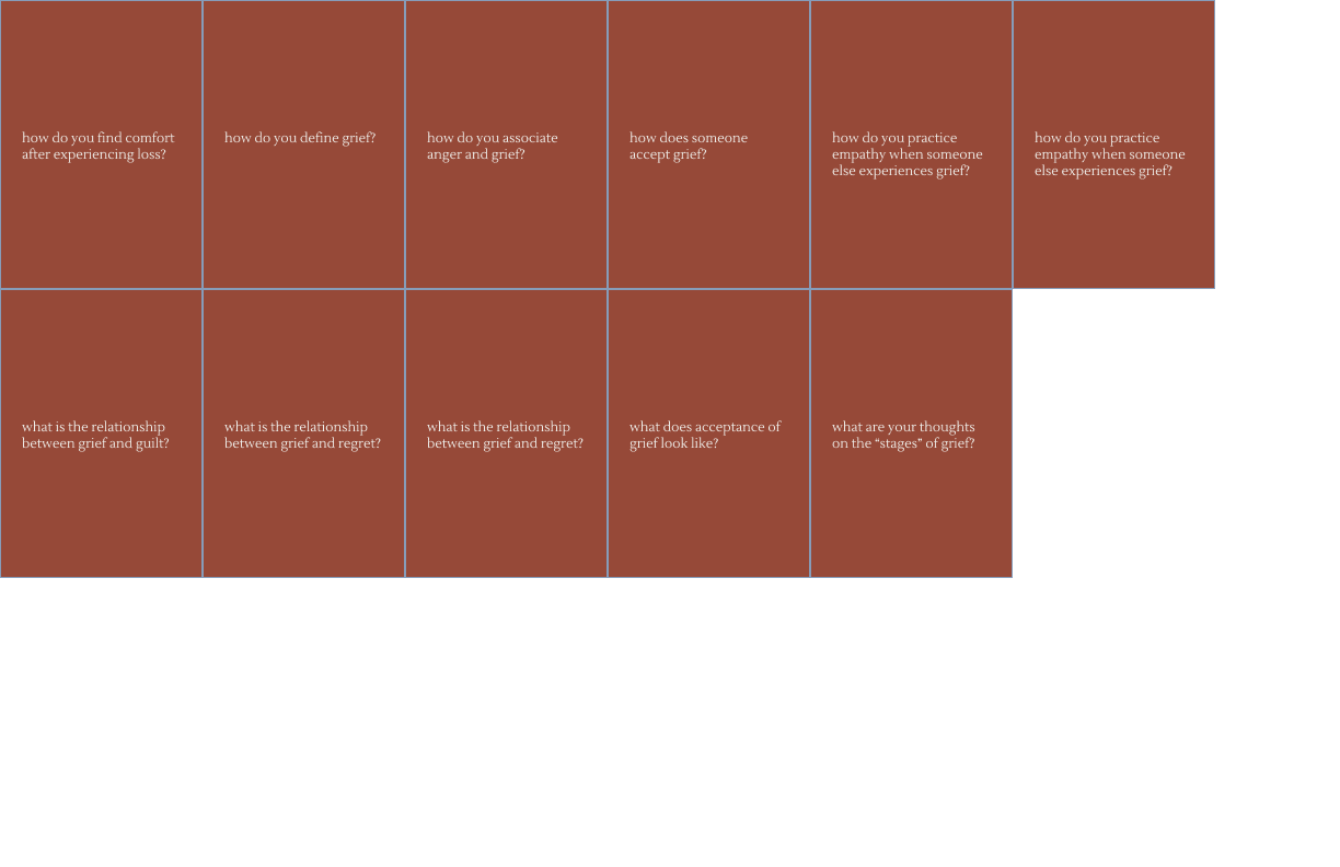
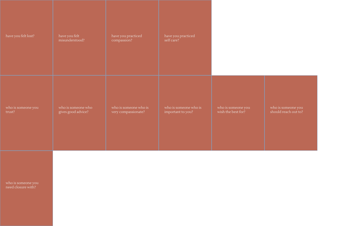
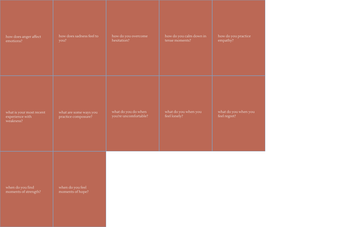
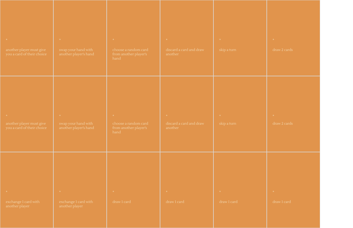
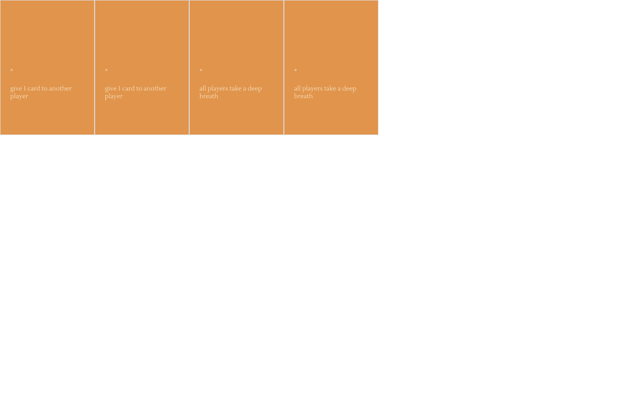
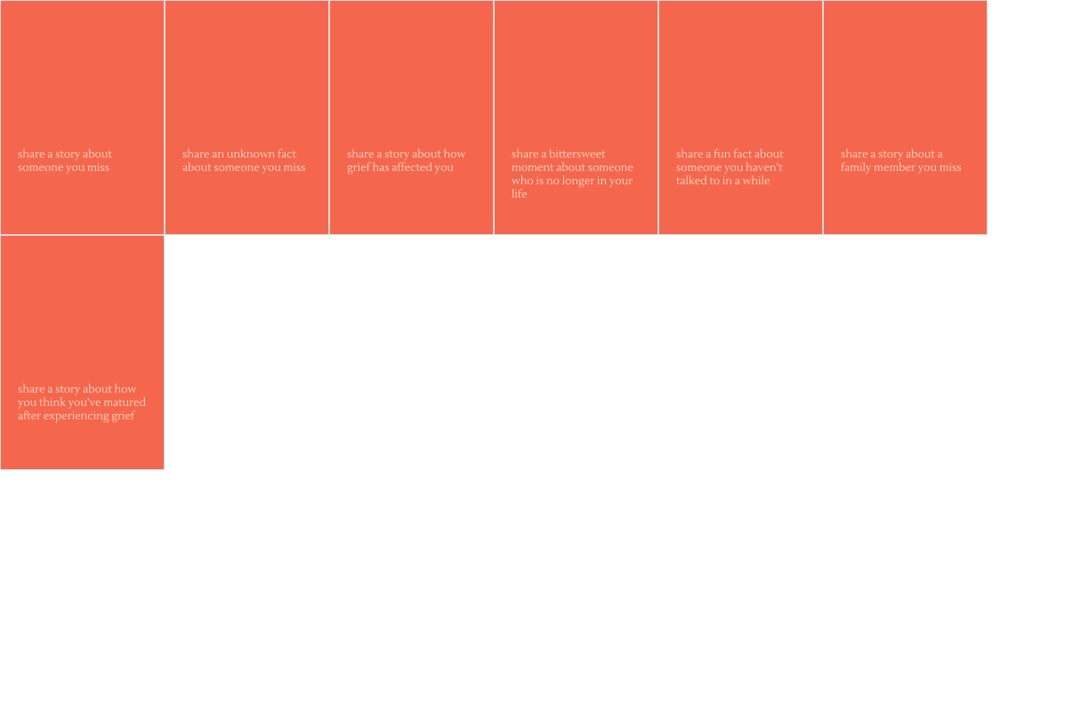
I revised the card prompts after removing and adding some (but without applying the new visual style yet). They’re all uneven because I grouped them by what kinds of questions they were asking to see how diverse it was. I wanted a good spread of deeper questions and more surface level ones.
Website
I didn’t get a chance to sketch wireframes because I got so invested in the design aspect of the cards. Instead I got started on a list on what I would actually want on the website. By having a guideline, it’ll motivate me to actually start thinking about wireframes.

Reflection
I think I got a lot of work done this week. A lot of progress was made with the visual identity like the logo and color palette. Once I go back to it in a couple of days, I’ll see if I still like it. I want to finish the card design as soon as possible so I can get it printed professionally and shipped to me in time. I only started with a checklist for the website but next week I’ll put a bigger focus on it. I’m also happier with the card prompts after I fixed them a bit.
Next Steps
I’ll start wireframes next week and go back to the visual identity a couple of times to make sure I still like it when I return to it. I’ll also continue to revise the card prompts.